A Comprehensive Guide To Color Theory For Designers
Color theory is a body of principles which provide guidance on the relationship between colors and the physiological impacts of certain color combinations.
Color theory is one of the most fundamental areas of painting. The importance of understanding color theory far exceeds simply knowing how to mix colors together (for example, knowing that yellow and blue make green).
As an artist, you do not need to worry yourself about all the complex underlying principles of color theory. Rather, all you need to understand is the general application of color theory and the relationship between colors. Color theory is a fundamental base of understanding for artists and should not be ignored.
Color theory will help you understand the relationship between colors and how we perceive them.
In this post, we will discuss all the major elements of color theory. However, this will only just touch on the surface of it. Color theory is an incredibly complex area. Luckily as artists, we only need to know certain elements of color theory which relate to us.
Bonus Download: Grab my free Color Theory Cheat Sheet.
The History Of Color Theory
General principals of color theory were evident in writings of Leone Battista Alberti (c.1435) and the notebooks of Leonardo da Vinci (c.1490). The first color wheel was developed by Sir Isaac Newton around the start of the 17th century. This color wheel was an arrangement of red, orange, yellow, green, blue, indigo and violet on a rotating disk.
Since the origination of the color wheel by Newton, it has become one of the most powerful tools available to artists for explaining the relationship between colors.
The three primary colors are red, blue and yellow. The three secondary colors are green, orange and purple. These are made by mixing two of the primary colors. There are six other tertiary colors.
Using the primary colors, you could mix pretty much any color in the spectrum. This is why a solid knowledge of color theory is so important when it comes to painting and mixing your colors. This is also why you should always at a very least have the primary colors on your palette.

Boutet's 7-color and 12-color color circles from 1708
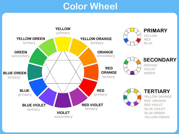
A Modern Day Color Wheel
Color Theory Terms
There are a number of color theory terms you will come across in art that are commonly misunderstood and confused.
Hue
The term “hue” is often used as a simile for the term color. Hue generally refers to the dominant wavelength of color out of the twelve colors on the color wheel (being the primary, secondary and tertiary colors).
For example, the hue of navy is blue. The hue of burgundy is red. The hue of sap green is green.
The colors below are hues.

Saturation
Saturation is a measure of how pure a color is. You can reduce the saturation of a color by adding gray or a color on the opposite side of the color wheel (which essentially kills the color).
If you completely de-saturate the color wheel, you are left with the following:

Tone
Tone is a widely misunderstood term and many artists are not entirely sure what it means, despite it being used so commonly.
Tone is a broad term used to describe a color which is not a pure hue and is not black or white. In many cases, artists use tone to describe a color which has been grayed down (de-saturated).
Value
Value is how light or dark the color is, on a scale of black to white. Value is widely considered to be one of the most important variables to the success of a painting.
A general rule I like to follow for painting is:
To increase (lighten) the value of a color - add white and/or yellow.
To decrease (darken) the value of a color - add blue, black and/or raw umber.
Value should be simple to understand, however, the inclusion of color can make it a challenging concept to grasp. You can have different colors which have the same value. If you take color out of the picture, then you will be left with just a range of black to white colors, with black being the lowest and white being the highest value.
This is why drawing is so highly regarded for improving painting ability, as it makes it easier to grasp the concept of value without having to worry about the inclusion of color.
It is widely considered by artists that value is more important than the color used in a painting. This is because value really sets the structure of your painting.
A value scale is below, starting with the highest value (white) to the lowest value (black). Between is basically a grayscale. You can make a colored value scale by adding white to increase the value and black to decrease the value. When you take the color away (de-saturate) the scale should look exactly the same as the value scale below. It is that translation between color and value which is extremely difficult to learn in painting.

High Key Versus Low Key
You will often hear paintings described as being high key or low key. This refers to the overall value scale used in the painting. A high key painting has a high-value scale (light) whilst a low key painting uses a low-value scale (dark).
High or low key paintings often have a very limited value range. Below is a low key painting by Vincent van Gogh (painted before he found color):
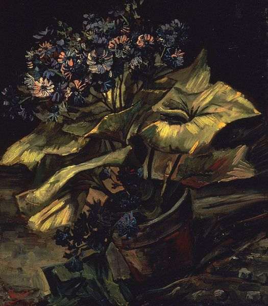 Cineraria, 1886, 54.5 × 46 cm, Vincent van Gogh
Below is a high key painting by Claude Monet.
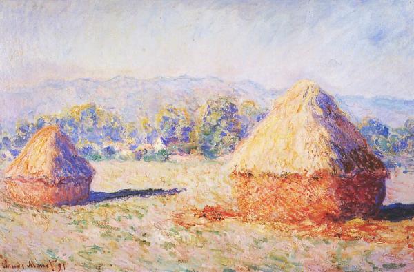 Grainstacks in the Sunlight, Morning Effect, 1890, Claude Monet
Tints and Shades
Put simply, a tint is a color plus white. A shade is a color plus black. You can get a range of tints/shades by adding varying levels of white/black.
TIP: At the moment, these are just words. They have no benefit without application. So I urge you to think of this scenario to put the terms into perspective. Say you have a tube of red paint. Most beginners would think, great, one color to use in my painting. But by adding different amounts of white, black and gray you have infinite variations of that color at your disposal. Once I understood this, I really started to see the options that were available to me.
Color Temperature - Warm Versus Cool Color
The color wheel is divided into warm and cool colors. When a warm color is placed next to a cool color, there is a very strong contrast. Alternatively, when a cool color is placed next to another cool color (for example, green next to blue) there is a pleasing harmonious effect. These color combinations are discussed in more detail in the section below.
Warm colors traditionally indicate activity and light. Cool colors on the other hand indicate calm, distant and soothing environments.
White, black and gray are generally considered neutral colors. I get the most use out of these neutral colors not by using them for what they are, but rather to change the value of my colors. For example, if you have cadmium red on your palette, you can add various amounts of gray to make a range of tones.
At the start of a painting, you should determine whether you want to achieve a warm, cool or neutral (balanced) feel. When I write neutral, I do not mean just to use white, black and gray, but rather an equal balance of warm and cool colors.
Learn more:
Color And Light - What Is Color Temperature

Color Combinations or Schemes
There are a number of commonly known color combinations which can be used to evoke certain emotions from the viewer.
Before starting a painting, you should briefly consider your color combination to ensure it aligns with your desired statement of the painting. For example, a complementary color scheme could be used for an aggressive and active scene. Whilst an analogous color scheme could be used for a calm and passive environment.
Here are some of the most well-known color combinations:
Complementary
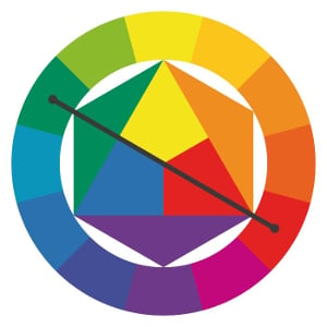
Complementary colors are opposite each other on the color wheel. When placed next to each other, there is an extremely strong contrasting and vibrant effect. If overused, your painting may become jarring and uncomfortable to look at.
You should select a dominant color and use the other color as an accent.
Analogous
A relaxing color combination using colors positioned next to each other on the color wheel. Analogous color combinations were famously used by impressionist artists such as Claude Monet to create beautiful harmonious paintings.
It is often most effective to select one dominant color, a secondary color and a third accent color.

Triadic
A triadic color scheme uses three colors which are evenly placed around the color wheel. The resulting effect is a vibrant scheme, even with low saturation. It is important to properly balance the colors to not overwhelm the viewer.
Generally, a dominant color is selected and the other two colors are used as accents.

Split-Complementary
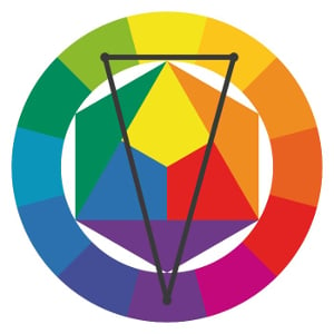
This is a variation of the complementary color scheme. In addition to the dominant base color, there are two complementary adjacent colors.
This color scheme is easier to balance than the complementary color scheme and is a great starting point for beginner artists.
Learn more:
Color Schemes in Art
The Psychology Of Color Theory
Color has a powerful influence over human behaviour, to the extent it can manipulate your perception of what is actually there.
Here are some colors and their emotional influences:
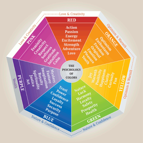
Red: Passion, love, anger and danger
Orange: Vitality, creativity and activity
Yellow: Energy, light and hope
Green: Health, nature and wealth
Blue: Trust, security and spirituality
Purple: Creativity, royalty and wealth
We can use these psychological triggers to influence how we want the viewer to perceive the painting. If you want the viewer to have a passionate and aggressive response, then you should be utilizing reds and other warm colors. If you want a calming scene, then greens and blues should be utilized.
Idealized Views Of Color
We all have preconceived ideas of what color an object should be. This idealized view can influence our perception of what is actually there.
If you are painting trees for example, there is a preconceived idea that trees must be green. But that is of course not the case. If you are not careful and do not observe the tree for what it actually is, then you may be drawn towards adding more green than is necessary based on your idealized view of what the tree is supposed to look like.
It is therefore important to paint what you see, not what you think.
Learning Color Theory As An Artist
Color theory can be incredibly complex, however for artists you only need to understand the general fundamentals of color theory. The best way to learn color theory is to purchase a color wheel or better yet, make your own using your own paints.
Another technique for learning color theory is to mix your own value charts of the twelve colors on the wheel (three primaries, three secondary and six tertiary). You will end up with a range of different values of the same color.
For the value chart, start with your base color, then work your way up in value by adding white (tints) and down by adding black (shades).
You should end up with a range of charts which you can use for later paintings as a reference.
You should also learn how to paint with a limited palette. The fewer paints you have on your palette, the more you will be forced to mix your own colors. This will train your mind as to how the colors relate to each other.
Summary
I hope you found this post useful. Color theory is a fascinating area and a fundamental knowledge for all artists.
This post just touches on the surface of color theory as it is an incredibly complex area. However, I encourage you to learn as much as you can about color theory as it will only improve your painting ability.
If you have any questions or comments, feel free to add them in the section below.
Additional Readings
How To Mix Vivid Greens And Why You Must Understand Color Bias
Inspirational Color Quotes By The Masters
The Beauty Of Muted Colors - How You Can Use Muted Colors More Effectively
How The Impressionists Used Complementary Colors To Great Effect
Using An Analogous Color Scheme To Create Harmonious Paintings
Thanks for Reading!
Thanks for taking the time to read this post. I appreciate it! Feel free to share with friends. If you want more painting tips, make sure you subscribe.
Happy painting!
Color theory is a body of principles which provide guidance on the relationship between colors and the physiological impacts of certain color combinations.
Color theory is one of the most fundamental areas of painting. The importance of understanding color theory far exceeds simply knowing how to mix colors together (for example, knowing that yellow and blue make green).
As an artist, you do not need to worry yourself about all the complex underlying principles of color theory. Rather, all you need to understand is the general application of color theory and the relationship between colors. Color theory is a fundamental base of understanding for artists and should not be ignored.
Color theory will help you understand the relationship between colors and how we perceive them.
In this post, we will discuss all the major elements of color theory. However, this will only just touch on the surface of it. Color theory is an incredibly complex area. Luckily as artists, we only need to know certain elements of color theory which relate to us.
Bonus Download: Grab my free Color Theory Cheat Sheet.
The History Of Color Theory
General principals of color theory were evident in writings of Leone Battista Alberti (c.1435) and the notebooks of Leonardo da Vinci (c.1490). The first color wheel was developed by Sir Isaac Newton around the start of the 17th century. This color wheel was an arrangement of red, orange, yellow, green, blue, indigo and violet on a rotating disk.
Since the origination of the color wheel by Newton, it has become one of the most powerful tools available to artists for explaining the relationship between colors.
The three primary colors are red, blue and yellow. The three secondary colors are green, orange and purple. These are made by mixing two of the primary colors. There are six other tertiary colors.
Using the primary colors, you could mix pretty much any color in the spectrum. This is why a solid knowledge of color theory is so important when it comes to painting and mixing your colors. This is also why you should always at a very least have the primary colors on your palette.
Boutet's 7-color and 12-color color circles from 1708
A Modern Day Color Wheel
Color Theory Terms
There are a number of color theory terms you will come across in art that are commonly misunderstood and confused.
Hue
The term “hue” is often used as a simile for the term color. Hue generally refers to the dominant wavelength of color out of the twelve colors on the color wheel (being the primary, secondary and tertiary colors).
For example, the hue of navy is blue. The hue of burgundy is red. The hue of sap green is green.
The colors below are hues.
Saturation
Saturation is a measure of how pure a color is. You can reduce the saturation of a color by adding gray or a color on the opposite side of the color wheel (which essentially kills the color).
If you completely de-saturate the color wheel, you are left with the following:
Tone
Tone is a widely misunderstood term and many artists are not entirely sure what it means, despite it being used so commonly.
Tone is a broad term used to describe a color which is not a pure hue and is not black or white. In many cases, artists use tone to describe a color which has been grayed down (de-saturated).
Value
Value is how light or dark the color is, on a scale of black to white. Value is widely considered to be one of the most important variables to the success of a painting.
A general rule I like to follow for painting is:
To increase (lighten) the value of a color - add white and/or yellow.
To decrease (darken) the value of a color - add blue, black and/or raw umber.
Value should be simple to understand, however, the inclusion of color can make it a challenging concept to grasp. You can have different colors which have the same value. If you take color out of the picture, then you will be left with just a range of black to white colors, with black being the lowest and white being the highest value.
This is why drawing is so highly regarded for improving painting ability, as it makes it easier to grasp the concept of value without having to worry about the inclusion of color.
It is widely considered by artists that value is more important than the color used in a painting. This is because value really sets the structure of your painting.
A value scale is below, starting with the highest value (white) to the lowest value (black). Between is basically a grayscale. You can make a colored value scale by adding white to increase the value and black to decrease the value. When you take the color away (de-saturate) the scale should look exactly the same as the value scale below. It is that translation between color and value which is extremely difficult to learn in painting.
High Key Versus Low Key
You will often hear paintings described as being high key or low key. This refers to the overall value scale used in the painting. A high key painting has a high-value scale (light) whilst a low key painting uses a low-value scale (dark).
High or low key paintings often have a very limited value range. Below is a low key painting by Vincent van Gogh (painted before he found color):
Cineraria, 1886, 54.5 × 46 cm, Vincent van Gogh
Below is a high key painting by Claude Monet.
Grainstacks in the Sunlight, Morning Effect, 1890, Claude Monet
Tints and Shades
Put simply, a tint is a color plus white. A shade is a color plus black. You can get a range of tints/shades by adding varying levels of white/black.
TIP: At the moment, these are just words. They have no benefit without application. So I urge you to think of this scenario to put the terms into perspective. Say you have a tube of red paint. Most beginners would think, great, one color to use in my painting. But by adding different amounts of white, black and gray you have infinite variations of that color at your disposal. Once I understood this, I really started to see the options that were available to me.
Color Temperature - Warm Versus Cool Color
The color wheel is divided into warm and cool colors. When a warm color is placed next to a cool color, there is a very strong contrast. Alternatively, when a cool color is placed next to another cool color (for example, green next to blue) there is a pleasing harmonious effect. These color combinations are discussed in more detail in the section below.
Warm colors traditionally indicate activity and light. Cool colors on the other hand indicate calm, distant and soothing environments.
White, black and gray are generally considered neutral colors. I get the most use out of these neutral colors not by using them for what they are, but rather to change the value of my colors. For example, if you have cadmium red on your palette, you can add various amounts of gray to make a range of tones.
At the start of a painting, you should determine whether you want to achieve a warm, cool or neutral (balanced) feel. When I write neutral, I do not mean just to use white, black and gray, but rather an equal balance of warm and cool colors.
Learn more:
Color And Light - What Is Color Temperature
Color Combinations or Schemes
There are a number of commonly known color combinations which can be used to evoke certain emotions from the viewer.
Before starting a painting, you should briefly consider your color combination to ensure it aligns with your desired statement of the painting. For example, a complementary color scheme could be used for an aggressive and active scene. Whilst an analogous color scheme could be used for a calm and passive environment.
Here are some of the most well-known color combinations:
Complementary
Complementary colors are opposite each other on the color wheel. When placed next to each other, there is an extremely strong contrasting and vibrant effect. If overused, your painting may become jarring and uncomfortable to look at.
You should select a dominant color and use the other color as an accent.
Analogous
A relaxing color combination using colors positioned next to each other on the color wheel. Analogous color combinations were famously used by impressionist artists such as Claude Monet to create beautiful harmonious paintings.
It is often most effective to select one dominant color, a secondary color and a third accent color.
Triadic
A triadic color scheme uses three colors which are evenly placed around the color wheel. The resulting effect is a vibrant scheme, even with low saturation. It is important to properly balance the colors to not overwhelm the viewer.
Generally, a dominant color is selected and the other two colors are used as accents.
Split-Complementary
This is a variation of the complementary color scheme. In addition to the dominant base color, there are two complementary adjacent colors.
This color scheme is easier to balance than the complementary color scheme and is a great starting point for beginner artists.
Learn more:
Color Schemes in Art
The Psychology Of Color Theory
Color has a powerful influence over human behaviour, to the extent it can manipulate your perception of what is actually there.
Here are some colors and their emotional influences:
Red: Passion, love, anger and danger
Orange: Vitality, creativity and activity
Yellow: Energy, light and hope
Green: Health, nature and wealth
Blue: Trust, security and spirituality
Purple: Creativity, royalty and wealth
We can use these psychological triggers to influence how we want the viewer to perceive the painting. If you want the viewer to have a passionate and aggressive response, then you should be utilizing reds and other warm colors. If you want a calming scene, then greens and blues should be utilized.
Idealized Views Of Color
We all have preconceived ideas of what color an object should be. This idealized view can influence our perception of what is actually there.
If you are painting trees for example, there is a preconceived idea that trees must be green. But that is of course not the case. If you are not careful and do not observe the tree for what it actually is, then you may be drawn towards adding more green than is necessary based on your idealized view of what the tree is supposed to look like.
It is therefore important to paint what you see, not what you think.
Learning Color Theory As An Artist
Color theory can be incredibly complex, however for artists you only need to understand the general fundamentals of color theory. The best way to learn color theory is to purchase a color wheel or better yet, make your own using your own paints.
Another technique for learning color theory is to mix your own value charts of the twelve colors on the wheel (three primaries, three secondary and six tertiary). You will end up with a range of different values of the same color.
For the value chart, start with your base color, then work your way up in value by adding white (tints) and down by adding black (shades).
You should end up with a range of charts which you can use for later paintings as a reference.
You should also learn how to paint with a limited palette. The fewer paints you have on your palette, the more you will be forced to mix your own colors. This will train your mind as to how the colors relate to each other.
Summary
I hope you found this post useful. Color theory is a fascinating area and a fundamental knowledge for all artists.
This post just touches on the surface of color theory as it is an incredibly complex area. However, I encourage you to learn as much as you can about color theory as it will only improve your painting ability.
If you have any questions or comments, feel free to add them in the section below.
Additional Readings
How To Mix Vivid Greens And Why You Must Understand Color Bias
Inspirational Color Quotes By The Masters
The Beauty Of Muted Colors - How You Can Use Muted Colors More Effectively
How The Impressionists Used Complementary Colors To Great Effect
Using An Analogous Color Scheme To Create Harmonious Paintings
Thanks for Reading!
Thanks for taking the time to read this post. I appreciate it! Feel free to share with friends. If you want more painting tips, make sure you subscribe.
Happy painting!